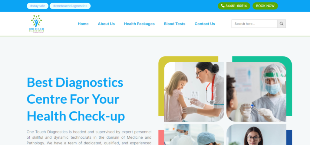
One Touch Diagnostics is the most rapidly increasing diagnostic service provider in Virar, Maharashtra. They offer a comprehensive in-house service from beginning to end. From the moment they receive a call to the home collection, testing of the sample, report creation, and delivery to the patient, the skilled in-house staff executes each step with precision and care. This service is provided to patients.
They have a crew of committed, competent, and experienced pathology specialists, and they have provided the most accurate test findings over the past few years.
One major challenge in creating a website for a diagnostic center is ensuring that it provides accurate and reliable information about the center’s services, as well as relevant health information for patients. This may involve working with medical professionals to ensure that the content on the website is accurate and up-to-date. Another challenge could be to make sure the site is user-friendly, easy to navigate and accessible to all users, including those with disabilities. This can involve using clear and simple language, as well as designing the site to be responsive, so it can be easily accessed on a variety of devices.
Together with the team from One Touch Diagnostics, our organisation conducted a comprehensive discovery and research effort to identify the key sources of discomfort and the obstacles each system faced at its current placements. We held a meeting with the owners, created a new presentation of information architecture, and built a new layout for the website’s navigational structure. As we progressed, we engaged the expertise of marketing team members to assist with content organisation and page layouts. Our objective was to discover the most effective approach for communicating information to both existing and potential new patients. In addition to using on-page statistics as a guide for these selections, we did so to get insight into the most efficient method to build a website that is user-centric from the ground up.
We improved the user experience by implementing best practices for user experience design and creating eye-catching page layouts with clear paths for patients to interact with the hospital, find information and contact us. We also developed a new editing experience for marketing teams to make modifications easily, and managed users to establish an appropriate hierarchy for editing, approving and publishing information. Additionally, we evaluated the migration from the perspective of SEO and created a plan to mitigate risk and transfer authority to the new website, while ensuring that the website adhered to the latest SEO best practices and had a page structure that would pave the way for future SEO success.
The new website led to substantial changes, including easier navigation and a simplified design, resulting in increased user engagement and organic traffic. The website’s editors were also given more freedom to make revisions, leading to increased productivity and reduced time for website enhancements.
Consult with a specialist to gain insight into the transformative potential of Digital Marketing for your business.

WebOwize was established in 2015 as a strategic B2B growth agency. We partner with clients to build ROI-centric campaigns that take your business to the next level.
Address :
18 Edenmills Dr, Toronto, M1E4L2, ON
Email :
Phone:
Copyright © Designed & Developed by WebOwize